Part One — A Little Flair Here and There — Five Rules You Must Follow When Working With Crazy
22 Sunday Apr 2012
Written by Amy
Any Room, Every Room, Industrial Modern, Minimalist Modern, Painting, Planning, Uncategorized
I would like to start this week’s post with an apology, as undoubtedly many of my faithful readers probably contracted the rare case of lack-of-new-Everyday-Modern-content-depression. Contrary to what you might think, I was not, in fact, sipping margaritas in some tropical location. My time recently has been otherwise engaged in the execution and recovery from cleaning, photographing, and retouching said photos of the apartment in preparation for Apartment Therapy’s annual Small Cool Contest submission. Happily, the judges deemed our submission worthy, and we have been gaining votes ever since. Come check us out here and add your “favorite” to the chorus!
All campaigning for votes aside, this week is the first of a two-part series on how to incorporate flair in your home without it looking like a train wreck. As the cornerstone to my design sensibility, I find that the little elements of the bold and unexpected, when incorporated correctly, are what really make the space fun and awe-inspiring to visitors. However, I have also learned that when trying to integrate something loud and bold, it needs to be done properly, otherwise it is just plain bad. When playing with flair, there is a very fine line between a smashing success and a complete catastrophe, and the following five rules will help you carefully tread that line and come away with a fabulous room.
Rule #1: Flair is only flair, if it’s not Everywhere — Even though everyone knows that thirty-seven pieces of flair is the recommended dosage, I advocate that flair is like a flour-less chocolate cake — just a little bit too much, and only good in small measures. And though it is fun to play with crazy ideas, don’t let yourself get too carried away. There should only be one or two main ideas in a room that are competing for attention. If you have more areas than that vying for visual emphasis, it just starts to look cluttered and messy, and that isn’t flair, it’s just ugly.
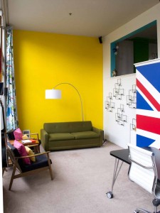
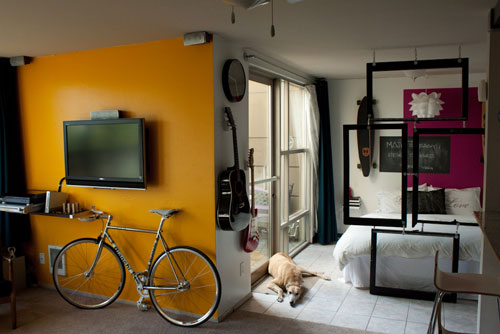
Between the loudly patterned curtains and the repetitive sconces, the blank yellow wall provides a place for the eye to rest.
Rule #2: Visual Rest Stops — As I mentioned previously, you want only a single big piece of flair in each room. To achieve this, you need to design areas for the eye to rest. This might be a blank wall, or just an unadorned surface. Whatever you do, if you are going to have something loud and visually heavy (a bold pattern, a bunch of bright colors all together, or an area with a lot of various items like a bookshelf), it needs to be balanced with something simple. Otherwise, your apartment will start to feel like a daycare full of little ADD-ridden design ideas all screaming for your attention. This condition has been known to cause hyperventilation and nausea to those of us who thrive in a well-designed environment.
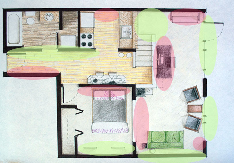
This plan illustrates the balance between areas of flair, and areas of rest (red indicates flair, green indicates rest)
Rule #3: Back to Basics — One of the first things you learn in design school is all about the correct application of the Elements and Principles of Design. And though the Elements don’t play so much of a role in the proper implementation of flair, the Principles methodically list out exactly what you need to keep in mind. And despite the fact that there is enough to learn about Design Principles to keep you busy for at least a semester, I will quickly touch on how to take them into account for this purpose. The Principles are: Axis, Symmetry, Hierarchy, Datum, Rhythm, Repetition, and Transformation. The most applicable to this instance are:
Symmetry: Symmetry really comes down to a matter of balance. As discussed earlier, when designing with flair, one needs to balance out the loud with the quiet, and this can be achieved though symmetrical balance, or assymetrical balance. In the case of the yellow wall, symmetrical balance is implied through visually weighted items on either side of the blank wall.
Hierarchy: Of the applicable Principles, hierarchy plays the largest role. Hierarchy can help determine what the focus of the room should be, and allows you to play around with varying levels of flair. For instance, the Union Jack wall takes highest priority on the level of hierarchy, but flair is also evidenced in varying other levels such as the Lego model of Frank Lloyd Wright’s Falling Water, bringing in a consistent design language through the incorporation of geekiness and whimsy.
Rhythm: Next, in order of importance, is rhythm. Like flair itself, a distinct rhythm needs to be established within the room. Without being able to pinpoint the cause, most people will have an adverse reaction to a space if the rhythm is off. Rhythm can be achieved several ways. You can simply have redundant elements to anchor the flair (such as like colors evidenced throughout), or similarly shaped, or sized items (for example, you aren’t going to put an overstuffed sofa next to a stunning low-seated mid-century modern chair, that would be unsightly!). If the rhythm of the room is right, the flair will work for you, if it’s wrong, the flair is only going to make it worse.
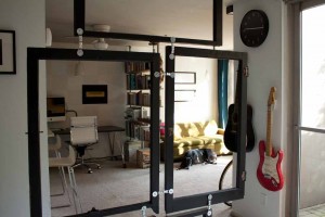
Flair with Function — these old windows serve as an interesting and unique room divider in a studio apartment
Rule #4: Make it Worth Your While — As a veteran implementer of flair, let me take a moment to note that, most often, the crazy and unexpected are hard to come by. Whether it is that difficult to paint crazy patterned wall, or a beautifully upholstered piece of furniture that is totally worth the extra dough because, really, when are you ever going to see a print like that again, flair will likely cost you time or money or both. So make damn sure it counts! If it isn’t saying something about your personal style or hobbies, it’s probably not for you. Flair should be fun, so make it reflect both your style and your home. Avoid the peer pressure, and don’t incorporate flair just because all the cool kids are doing it.
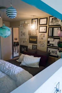
Although I am a strong advocate of minimalism, the closely displayed array of personal artwork acts as a unique element of flair in a room devoid of anything else on the walls.
Rule #5: Think Outside the Painted Box — Don’t get caught up in only incorporating flair one way. Boldly colored walls are great, but having a few bright tones does not flair make. So get creative and start thinking of other ways you can incorporate flair — perhaps it is a flamboyant pattern, a loud piece of artwork, or, my personal go-to, your own exclusive brand of geekiness. As Uncle Mies reminds us, God is in the details, so start having some fun, grow a pair, and let your apartment speak for itself.
For more ideas on ways to incorporate flair, stay tuned next week for the follow up post, but for today, that’s all I’ve got. So as always, feel free to share or re-publish, just please give me credit for my work when you do! Cheers till next time!

2 comments
May 27, 2012 at 12:59 pm
Hi, i read your blog occasionally and i own a similar one and i was just curious if you get a lot of spam feedback? If so how do you prevent it, any plugin or anything you can recommend? I get so much lately it’s driving me mad so any support is very much appreciated.
June 11, 2012 at 5:37 pm
Hi Niko,
We use the Akismet plugin, its free (but you can donate if you’d like) and works great with WordPress.