Flairing it Up like the Bad-Ass that You Are — Part Two
29 Sunday Apr 2012
Now that you are all well-versed in the cardinal rules of incorporating it, you might be wondering exactly what constitutes flair and perhaps even longing for a few out of the box ideas. So stop biting your nails and wetting your pants about it, because this week I will be discussing a few areas within the typical interior that just beg for a little inspiration. My sincere hope is that after this two-part series, anyone and their mom will be able to take that boring beige apartment and make it into something fantastic.
Use your verticals — The first area that I will be discussing is the wall. If you are like me, your 500 square foot floor is nothing compared to the beckoning volume that comprises your vertical wall surfaces. So don’t take that space for granted, as a little $15 quart of paint can turn your studio into a rockstar of urban design. However, as I learned the hard way (yes, I’m looking at you orange bedroom), there is a right and wrong way to mix flair and paint. So read on for the two different flairy flamboyant camps on paint.
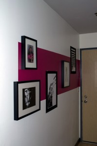
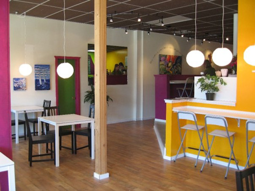
This hot pink box is playful and bright, but also helps to ground the photos and provide visitors with a warning of the over-stimulating environment within
A little dab’ll do ya — As everyone who knows me can attest, any bright color is fair game. Hot pink? For shizzle. Neon green? You bet. Blood red and blueberry blue? Totes boats. And as you set your barf bucket aside, let me assure you that these colors are harmoniously living together in 600 square feet. Why is that? Because it’s only a little bit here and there. Aside from my 12′ high yellow wall, I do not have more than a quart of any one color in my apartment.
The secret is to have everything else be the canvas and just let the color shine. Call me crazy but I love me some bright blank apartment white. In fact, that’s the first thing I do when I move in, paint everything bright bright white, because then nothing else is competing with the color or reflecting hues into it and making it all muddy and nasty. So the first rule of mixing flair and paint is to do so in small doses. Really, you don’t need a lot of hot pink to make your point.
Paint outside the lines — Hands down, when someone first comes to my place they aren’t commenting on my perfect corners and stunning use of tape. They are talking about my custom painted walls. And guess what? I suck as an artist, so don’t go thinking I have some mad skills that you don’t and that’s why you’ll never be as awesome as me. Truth is, if you can trace or tape, you too can have a custom wall.
As you already know, I have the Union Jack on the office wall (made possible by a straight edge and masking tape), and to be honest, when I leave this apartment, that’s one of the things I will miss the most. But since I’ve beat the Union Jack horse dead into the ground with previous posts, I thought it prudent to highlight a few other creative geniuses and how they have done custom walls (most likely using a good old projector and tracing the design onto the wall).
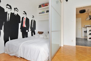
I love love love this wall. And to be honest, aside from the tip speech, I am not even a huge fan of the movie. But damn, what an excellent implementation of pop art, paint, and flair. In fact, this room inspired me to design in something similar for my new place (although after reviewing the flair to rest ratio it had to go). But instead of going to bed each night with visions of Mr. Blonde and a straight-razor, I was thinking something more along the lines of the iconic Mad Men imagery, or even a stylized silhouette of the Avengers (yes, I’m a nerd). This type of flair incorporation really opens itself up to whatever you’re into, and for the price of renting a projector, is pretty budget-friendly.
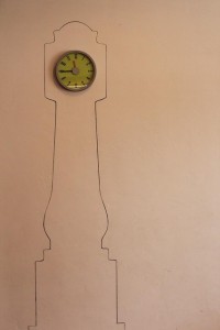
This little clock is another example of using a little bit of paint to add a lotta bit of flair. And the best thing is, it is so simple, you just want to slap your forehead and say “why didn’t I think of that?”. I could see this idea being implemented either as the simple line drawing shown here, or just blocking out the entire grandfather clock area and making it a silhouette. With the limitless options for scaling and color choice, this is another design that makes me want to pull out the paint brush.
Crazy Bold Fabrics — As an alumni of an interior design program, it took me several years to reach the point where fabric swatches didn’t make me gag. True story. I hate fabrics. However, after discovering the textile selection at Ikea, my life took a turn toward decoratorness that I still have trouble reconciling myself to at night. But the fact of the matter is, fabrics play a big part of any home. By the time you add up pillows, furnishings, curtains, duvets, and blankies, you’ve got a big old pile of fabrics that better be worth their salt when it comes to design weight.
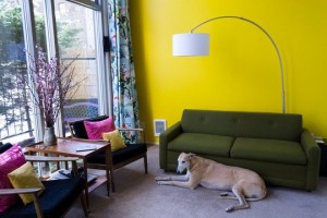
I have several great textiles that I purchased from Ikea, almost exclusively because Ikea gets it. My curtains that are 12′ tall by a total of about 20′ wide, and have a variety of super fun and crazy images, anything from dead goat heads playfully floating in a pond, to some swedish version of a GI Joe waving from atop a snowy mountain. When paired up with the hot pink pillows on the adjacent mid-century chairs, the flair-sodden fabrics are just another avenue for me to test the limits of my wonderfully understanding husband’s metrosexualness and squeeze in just a little bit more hot pink. And as much as I despise textiles, my apartment just wouldn’t be the bold and creative place that it is without them.
God (or the devil) is in the Details — The details are my favorite place to squeeze in a little bit of flair. In fact, if you have any personality whatsoever, it is nearly impossible not to incorporate flair in the details. However, because some people’s details are comprised of glass figurines and wretch-inducing little knick-knacks, it’s worth mentioning that gee-gaws and flair are not synonymous with one another.
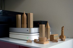
I love using pop culture icons as elements of flair. We purchased an awesome little wooden blocks set of Manhattan that resides on our minimalist stereo cabinet. Or another little detail that I adore is the original GI Joe doll (circa the 1950’s — his clothes are actual fabric and he has a sleeping bag that he packs on his back), sitting next to the molded plastic astronaut that we picked up at the Seattle Science Center. They hang out together and just emanate bad-assery from the bookshelf. They are also completely comment worthy. So I guess what I am trying to say, albeit in a long-winded way, is that if you, nor anyone else, would ever think your details are interesting enough to comment on, they are probably just crap that should be tossed immediately.
A smirking sense of irony — At the end of the day, the whole point of flair, is that you can’t fake it. Your space is either interesting and full of creativity, or it’s not — you can’t just hire a designer to make you an awesome flair-filled space, because if you’re not awesome and interesting, everyone will know you’re just a wannabe.
Flair is really all about personal expression and finding fun and ironic ways to shout it out. Grow a pair, man up, and say, “hells yeah, I think the Avengers are so awesome, I’m going to paint them on my wall” — if it’s well done, and put together with an overall aesthetic in mind, it doesn’t matter what the subject is, people are going to think it’s super rad that you’re ballsy enough to do something out of the ordinary and be who you are. That’s what flair is really all about, so get out there, have some fun with it, and wow your friends at your next backgammon tourney.
That’s all I have for this week. Luckily for all of you, I made it a super awesome article because it will have to sustain my devoted following through next week as the world headquarters for Everyday Modern will be moving it’s physical location. I’m pretty bad ass, but I don’t think I’ll be able to move, design, and write all in two days whilst maintaining the small shred of sanity that remains in my possession. Check back in a couple of weeks for updates on the new digs. Until then, thanks for reading and please feel free to re-publish and share — just please give me credit for my work when you do. Cheers!

