Design Fail — When Good Ideas Go Horribly Wrong
19 Sunday Feb 2012
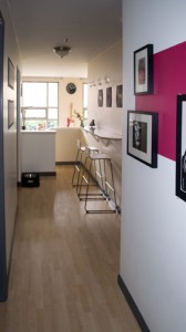
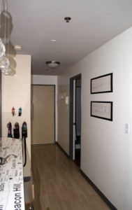
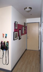
This week, I thought I would take a little detour from the usual post about how to pro-actively make your dwelling a more beautiful environment and discuss how to avoid accidentally making your dwelling a hideous place. The inspiration for this post came from an impulse purchase at Home Depot about a month ago, and I learned a valuable lesson — Saving six dollars on a quart of paint is not a bargain if you haven’t taken the time to properly select the color of said paint. As a result, my hallway trim now is now an un-loved bastard of a color born of prison-cell gray and the ultra-fetching utilitarian metal trim found at any elementary school. So, to save you all the heartache of repeating this terrible offense against color theory and good design aesthetic, here are the lessons that I have learned:
 Use caution when applying inspiration - I know what you’re all thinking — “Where on Earth did the choice to use gray paint come from when the adjacent colors are hot pink and neon green and bright white?” Alas, a recent visit to Ikea Hackers led to an infatuation with gray (you can see the gray in question in all it’s stunning glory here), because the delightfully creative Capree Kimball introduced it so well into her lovely home. However, just because it works very well in her home, does not mean I can just willy nilly start painting things gray in my home.
My hard earned design aesthetic hinges on bright color and stark white, with no room for gray. Though I am usually pretty good with this, I have been reminded to take inspiration into consideration and adapt it to fit my home, not just yank it out of a great photo and start painting.
 Plan, plan, plan - The morning I purchased the can of “Jail Cell Chic” started like any other Saturday. After the obligatory visit to the bakery, JT and I went on our bi-weekly pilgrimage to Home Depot. When we moseyed into the paint department, and Oh Happy Day! I found that they had a closeout on Martha Stewart paint and a quart of high-gloss paint (normally $12), was marked down to $4! I finally had the kick in the pants I needed to paint the “new” trim we installed the year prior. So after about thirty seconds of deliberation, we asked the polite gentleman at the paint counter to mix us up a quart of what seemed like a “good” gray.
The problem here, is that normally before letting just any color into my home, I run the sample chips through a rigorous testing process. I will hold the hues up to every other color that might possibly come into visual contact with them (that’s right, if you can stand on a stool and lean out over the counter and the wall in question might align with that pillow in the living room, they darn well better look visually harmonious). In bypassing this testing and haphazardly purchasing the can of paint, I put my fate in the hands of the design gods, who, without proper worship through design development, can be a pretty persnickety bunch.
Live and Learn - It is inevitable that in the quest for the perfect abode, you will fail from time to time. The key to success is to not beat yourself up — the creative process is full of failures. In the words of Maury Ballstein “We get back on the horse”, so take what you’ve learned and store it away for next time! At any rate, it will come in handy when you are re-doing whatever mess you’ve created in the first place!
So what will I take away from this dastardly project? 1. High gloss paint looks terrible on trim, unless you can spray it on. 2. A dark colored trim in a small area is way too overwhelming and is more appropriate for a victorian-era home than a would-be modern apartment. 3. Dark gray and hot pink look gross together. 4. It’s time to paint the upstairs trim bright white!
That’s all I have for this week — I hope you have found it both entertaining and educational. As always, thank you for reading, and please feel free to share — just please give me credit for my work when you do!

